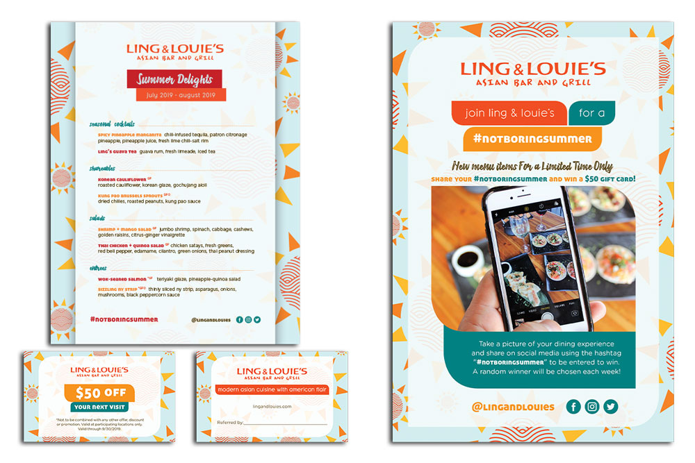
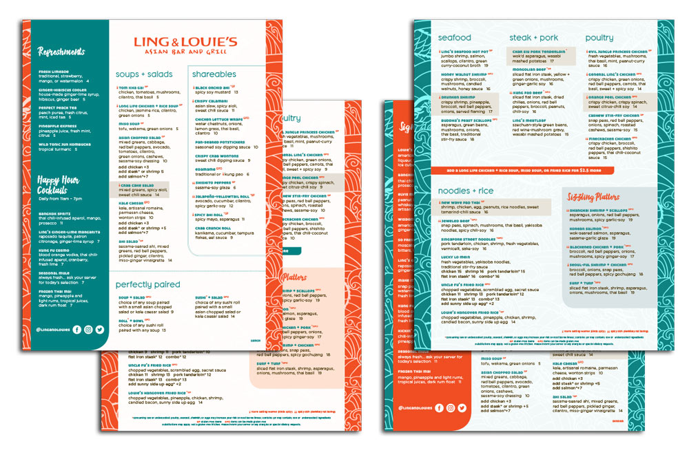
Every restaurant has a concept, echoed by everything from menu items to decor. Yet, too many restaurant owners fail to incorporate the essence of their enterprise into their menu designs. Your menu is your most valuable salesperson, so it must resonate with your guests. Furthermore, if it’s featured on your website, shared via social media, or available on an online ordering site, your menu must be capable of attracting new customers to your brand.
Your menu design should complement the theme of your restaurant, the ambiance of the establishment, and your company values. When visiting a fine dining establishment, for instance, patrons expect to see a menu consistent with the restaurant’s brand image. It should have an elegant design, exotic descriptions, and be printed on heavy paper. Conversely, choosing such a formal menu design for casual cuisine would send the wrong message - coming across as inauthentic.
Your menu descriptions, fonts, and colors should be consistent with the image you wish to convey. Here are some guidelines for crafting a menu that is engaging, easy to read, and supportive of your brand message:
Descriptions
Your description should include more than just ingredients - it must express the feeling you’d like the dish to convey. Dining is a sensory experience, and menus designed to appeal to the senses generate more sales. Whether your restaurant’s style is elegant or fun, descriptions should be tailored to fit. For instance, a casual dining menu may mention ‘chocolate filling’ while an exclusive French restaurant might use ‘ganache’. Regardless of your style of restaurant, shorter menus tend to perform better. A single restaurant can’t possibly excel at every dish on a ten page menu, and most diners would rather choose from 10 amazing dishes than 100 mediocre ones.
Fonts
Your menu must be easy to read. It may be beautifully designed, but if your guests can’t understand it the design won’t matter. Fonts should always be legible and appropriate for your audience. Think sans-serif print for children’s menus, and larger fonts and leading for senior menus. Calligraphic typefaces are best suited to an upscale establishment, while block lettering is perfect for barbeque. Low-light restaurants need larger, cleaner fonts. Keep the font size at 12 points or larger, choose no more than three different type styles, and use exotic typefaces sparingly.
Colors
The background hues you choose should be consistent with the guest experience you wish to create. Consequently, a quiet French bistro should choose a different color palette than the one used by a boisterous Mexican restaurant. Brown, green, and grey are calm, neutral colors that tend to be soothing. Orange, red, and yellow are warm and vibrant, and serve as an appetite stimulant. Black and white is a classic look appropriate for high-end establishments.
Your menu is the only form of communication from you that 100% of your restaurant’s customers will encounter. It represents the culmination of your efforts to immerse your guests in the ambiance and experience of your establishment. Ensure that your menu is in sync with the restaurant concept you’ve worked so hard to create.
We Think You'll enjoy these articles
Don’t want to miss out on our articles and insights?
Sign up for the Miss Details newsletter today.


