Not everyone is a wine expert, and sometimes we need a little help in choosing a bottle. Do we ask for help? Occasionally, but usually we just look at the label and find one that looks best, or sends a message we respond to.
Wineries are constantly looking for ways to stand out. Most people buying wine aren’t at a winery – they’re in a grocery or liquor store. Selling a bottle before someone has tasted it is not easy. This places a lot of pressure on the wine label. The design needs to grab the attention of the buyer, convey certain vital information about the wine (type, red or white, grape varietal, region of origin, surgeon general warning, health information, etc.), and tell a story that aligns with the experience the buyer is trying to create. The experience created arrives from sensory design, which is design that evokes an intuitive response by engaging one or more of the senses.
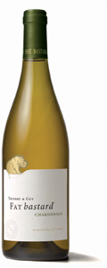
Modern wine labels are designed to stand out. A perfect example is Fat Bastard, a wine from Southern France that uses its unique name and a sitting hippopotamus to play to the idea from their website that “most people bought a bottle because of the name and returned to buy cases because of the quality.” This technique has worked very well for Fat Bastard, which is now the best-selling French Chardonnay in the United States.
This doesn’t mean that all wineries should rename their wine and put an unexpected animal on the label. The wine label must align with the brand and positioning of the producer. The label may have a traditional French chateau, indicating the region where the grapes were harvested. Or it may have images of the family that created the wine, with the different generations of family members indicating the maturity and age.
Next time you’re choosing a bottle of wine, maybe you’ll notice that the label has a bit more influence on you than expected. Or have you already noticed? We’d love to hear about you favorite label!
