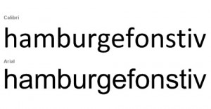
When Microsoft changed its default typeface from Times New Roman (Word) and Arial (Powerpoint, Excel) to Calibri, you might have assumed that Microsoft decided it was time for something different. But in business, there is always a reason for change. In this case, the change reflects a culture shift. Do you print every e-mail you receive? Probably not. In our blog Font vs. Typeface, we discussed how sans serif typefaces increase readability on computer screens.
Calibri is a san serif typeface created specifically for Microsoft by Lucas de Groot. It is part of Microsoft’s ClearType technology. ClearType technology was created to “improve readability on LCD screens.” Because LCD screens are the status quo for computers, tablets, smart phones, netbooks, and notebooks, the shift to sans serif was the right choice. Our culture thrives on mobility and adaptability, and Microsoft aimed to increase readability with the default typeface change.
Did you notice when Microsoft changed to Calibri?

