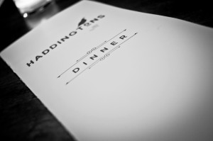
A menu should reflect your business, entice your customers, and increase profits all at the same time. These goals can be realized with the three secrets to menu design: typeface, overall aesthetic, and diction.
Typeface
First, ask yourself a few questions.
- What is the theme of the restaurant/menu?
- What kind of feeling are you looking for? i.e. sophisticated, minimalist
- What words describe the feeling you’re looking for?
- What kind of lighting will there be when customers are reading the menu?
- Are there any practical constraints? i.e. lighting and space
Take the answers to these questions, and choose a few fonts. Then, with the fonts in mind, ask yourself a few more questions.
- Is it easy to read?
- Does it distract the reader?
- Does it look to big or too small (usually font size over 12pt. is too big)?
- Does it relate to the restaurant logo and other signage?
A study in Psychological Science states that, “People infer that if something on a menu is difficult or hard to understand or hard to read that it takes great skill and effort to prepare.” Other menu experts disagree. Founder and CEO of Quantified Marketing Group, Aaron Allen states that he raised sales of a restaurant just by making the font easier to read. He suggests using simple language, few capital letters, and a sans-serif font. Whichever method you decide, make sure you test it first!
Overall look of the Menu
Believe it or not, there is such a thing as “menu engineering.” Also referred to as menu psychology, it refers to “the field of study devoted to the deliberate and strategic construction of menus”.
Keep in mind where guests look the most on your menu. On a three-page menu, the guest will look to the top right and left corner, and to the middle of the center page. On a one-page menu, the guest will look to the area right above the center. These are key places to position the restaurant’s most profitable items.
Prices should not be aligned to the right and stacked beneath one another. Stacking allows the guest to find the cheapest item without even looking at the descriptions. The price should be integrated with the description of the menu item and placed only a few spaces away from the last words of the description. The prices should not have “…” leading to them and should not be bold. Bold prices give the guest the impression that the dish is more expensive than it actually is.
Photographs should be of fine quality. Tantalizing pictures of food and drinks are going to make your guests want to try the item. If a picture looks dull, or the color is off, the guest will think that it tastes dull too. Photographs should be professional, bright, and vivid.
If you have specialty items, you want your guests to notice them. Do this by making the items bold, using a different font, or adding a star or logo next to them. Another group of items you want to stand out are the new dishes. Create menu inserts that are easily replaced when new items arrive.
Choosing the Right Words
How do you make a dish sound appetizing? Evoke emotion in your descriptions, and view them as little advertisements for every dish. Be specific: “with a hint of cinnamon,” “sautéed onions,” or “lightly sprinkled with parmesan.” Think of what flavors or spices are in the dish and then analyze the way it is prepared. Use a dictionary or thesaurus as a resource to expand your food vocabulary. Longer descriptions should be used on more profitable, specialty items.
Remember that your menu is a reflection of your restaurant. It is brand identity that guests see over and over again. Use your menu as the window into your guests’ heart and soul – and make sure you make a great impression!
Do you have a favorite menu? We’d love to hear about it!
Did you enjoy this? You might also like:

