We are constantly surrounded by extreme emotions – from tear-jerking movies in the theater to stories on the news, it seems as if we have become numb to the effect our experiences have on our emotions. If the goal of your business is to stand out, your logo needs to break through and evoke emotion!
The key to creating a logo that resonates with your brand and target audience is to work with someone that is willing to spend the time to gain an in-depth knowledge of your company. Don’t be surprised by a few odd questions, like “If your brand were a cartoon character, who would it be?” While they might make you laugh, they help designers figure out who your company is, and how it should make your target audience consumer feel. For example, an insurance company would want their logo to advocate a sense of security, whereas a hiking company might want to evoke a sense of adventure.
Your logo is everywhere – company letterhead, business card, e-mail signature, and even your Twitter and Facebook. A picture says a thousand words, so your logo should say a million. Just make sure it’s saying what you want it to.
In this article from Sitepoint, they share few examples of how to evoke positive emotional reactions with logo designs:
1.) Focus On A Single Emotion
Okay, so focusing on an emotion is fairly obvious, but many designers try to accomplish too much within a single design, dilute their efforts, and spread themselves to thin. Not all designers focus their efforts by asking the client this specific question: What do you want customers to feel when they notice or recognize your brand? Common answers could include: happy, trusting, strong, joyous, sexy, and a variety of other positive sentiments. If you can establish a single primary emotion, that eliminates a lot of non-ideal design work, and the targeted sentiment becomes your design objective.
2.) Focus On Brand Attributes And Product Benefits
If you are creating a logo for the entire brand, then be sure to gain an understanding of how they would describe their brand attributes. Basically, ask what the brand is at its very center, its heart. For instance, Lexus is known under “The Relentless Pursuit of Perfection.” Similarly, Nike’s brand attribute is “authentic athletic performance”.
If you are designing a visual for a specific product, then ask for the specific product benefits. Remind your client that benefits are different from features. A feature is the size, weight, ingredients, shelf life, or any other technical specification. A benefit is the underlying emotional need that the product fulfills. For instance, a lower calorie dark chocolate bar comes with the features of fewer calories but a rich taste to satisfy sweet cravings. The chocolate bar’s benefits could then be said to help create a slimmer figure, a greater sex appeal, more confidence, and ultimately a desirable partner. (Keep in mind that you don’t have to agree or even like the projected benefits to create a winning design.)
3.) Focus On The Audience
Knowing the target market of your client will help you even more in understanding how to evoke the right emotions. This is where your brand expertise may need to come into play. Some companies may not have a clear determination of their audience. Hopefully, asking the first two questions above will help you direct the client somewhat.
You’ll want specifics: an age range, income level, gender, location, career, and more. The greater the details, the better you can research what speaks to this group of consumers or businesses. Try to think like the customer of this brand, not like your client. Often a client will tell you what they think their customer thinks, or even worse, should think. It’s your job as the designer to see past any misconceptions put yourself in the eyes and emotions of the consumer. Your outside perspective can be invaluable.
4.) Anticipate Concerns
After you come up with a few mock-ups, consider any concerns your client may have with the concept. Do the visuals portray enough emotion or the right emotion? Also try to anticipate misconceptions consumers may have when viewing the design, including unintentional visual ambiguities, which have sunk many flawed brands. Just as with writers, designers and even the clients can get too close to their work and miss a glaring issue. Put your work aside and come back to it later. Ask friends, family, and colleagues for their opinions.
The next few points deal with different design ideas for including emotional elements in your visuals. If you are stuck as to where to begin, you may want to try one of the following.
5.) Create Metaphorical Comparisons
A metaphorical comparison in design is done by comparing the brand or product to a seemingly unrelated item. For instance, if the company was a drink, what kind would it be? If this shampoo was a car, what make and model would it be? This exercise can help to catalyze creativity and gain a better understanding of your client. It’s a good idea to ask your client’s opinion on such comparisons for the most accurate answers.
6.) Use A Symbol
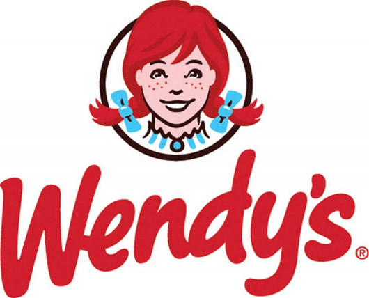
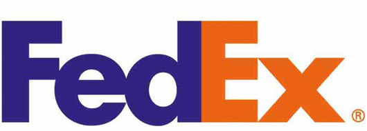
Sometimes an emotion can be conveyed with a simple symbol. Some companies have even chosen a more subliminal approach to evoking emotions in their logos, such as the FedEx logo that uses the negative space within the typography to hide an arrow, suggesting forward movement. More recently, the fast food chain Wendy’s recently updated its logo and even included an almost indistinguishable “mom” on the collar of the girl’s dress.
Symbols can also be more obvious in their approach to evoke emotions. For instance, Amazon’s upward curved arrow points from the “a” to the “z” within the word and also looks like a smile. Walmart’s brand redesign in 2008 included a new “spark” symbol, which added a more happy and upbeat look and feel to the brand.


What is your favorite logo? We know there are some really good ones out there, and we’d love to hear what you like!
