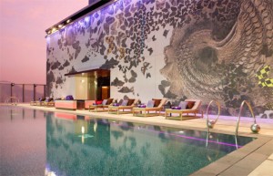
The W Hotel uses purple as a design element as a subtle gesture that adds to the guest experience. In a previous post, we mentioned that purple symbolizes a lifestyle of luxury, royalty, and class – all of which perfectly align with the W Hotel brand. When a guest stays at a W Hotel, they are treated like royalty – the staff anticipates guests’ needs, requests, and strives to achieve perfect guest satisfaction. The W uses purple and other exotic colors to ensure that design elements within every hotel communicate the service guests should expect when staying at the W. 
The W prides itself on being an innovative, contemporary, design-led lifestyle brand. The hotels are “a world of sensory experiences,” and the W uses these experiences to create loyal guests and a recognized and established upscale brand. In addition to consistent color schemes, the W Hotel has created a brand language, and offers guests a guide to the terms it uses to describe seemingly ordinary things, like the pool (Wet), restrooms (WC), and elevator (lift). This use of insider language gives people the feeling that they are a part of the exclusive club of W Hotel guests. Just by taking part in separating ordinary things from the general vocabulary of people, the W lets guests in, and forms a community.
