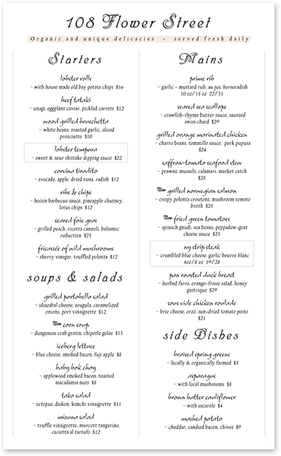
In a previous post, we discussed a little bit about how typography can impact a menu, but we barely scratched the service on the influence it has on the restaurant brand experience.
A menu’s typeface, when put to correct use, can be the window into a restaurant’s kitchen, environment, and even its culture. It can form the impression that keeps your guest entranced by your brand after they are greeted and seated, but before they taste the food you have to offer. While it may be tempting to get fancy and elaborate with fonts and typefaces, there are a few things to keep in mind.
First, your guest must be able to read the items on your menu. This means that when choosing a font it is best to keep the lighting in the restaurant and the age of your customers in mind. You should also try to avoid clutter by spacing items and sections so guests can process what is on the menu. Everything associated with your specific restaurant brand should target your niche market and reflect its needs and tastes, including the readability of your menu.
menu.
There is some debate on the perception people have when they have trouble reading a menu. Some menu engineers say that the harder a menu is to read, the perceived value of the items increases, with some restaurants going so far as to hand out reading glasses to patrons, while others have seen a sales increase that coincides with better legibility. Identifying your brand and target audience will help with choosing a specific theme for your typeface. Keep in mind that if you do choose a hard-to-read font, you do not want to cross the line from “difficult and intriguing” to “impossible to see, I’m not coming back.”
Have you seen any menus that are hard to read and deterred you from returning? We’d love to hear about it!
